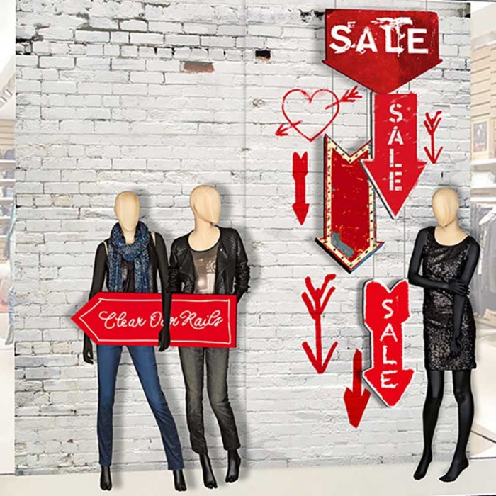


Drei verschiedene Sale Konzepte hat Deck5 für Steet One in den letzten Jahren in die Stores gebracht. Die Konzepte sind grafische Lösungen mit rot als vorherrschender Farbe. Das erste Konzept aus dem Jahr 2013 basiert auf einer Collage, aus einer Variation von Pfeilen und Sale-Wordings.
Das Konzept von 2015 ist cleaner, aber nicht weniger grafisch: Rottöne, Typoüberlagerungen und eine klare Message für den Kunden sind hier die wesentlichen Elemente.
Im Sale Fenster von 2016 steht das rote Quadrat im Vordergrund – in Anlehnung an das Street One Logo. Die roten Flächen dieser Kampagne haben eine aquarellierte Anmutung.
Three different Sale concepts have been brought to the stores for Street One by Deck5 in recent years. The concepts are graphical solutions with red as the dominant color. The first concept from 2013 is based on a collage, a variation of arrows and Sale-Wordings.
The concept of 2015 is cleaner but still a graphic approach: shades of red, typograpic layers and a clear message for the customers are the essential elements here.
For the Sale window of 2016 the red square is in the center of attention – it points out to the Street One logo. The red surfaces of this campaign have a watercolor look and feel.